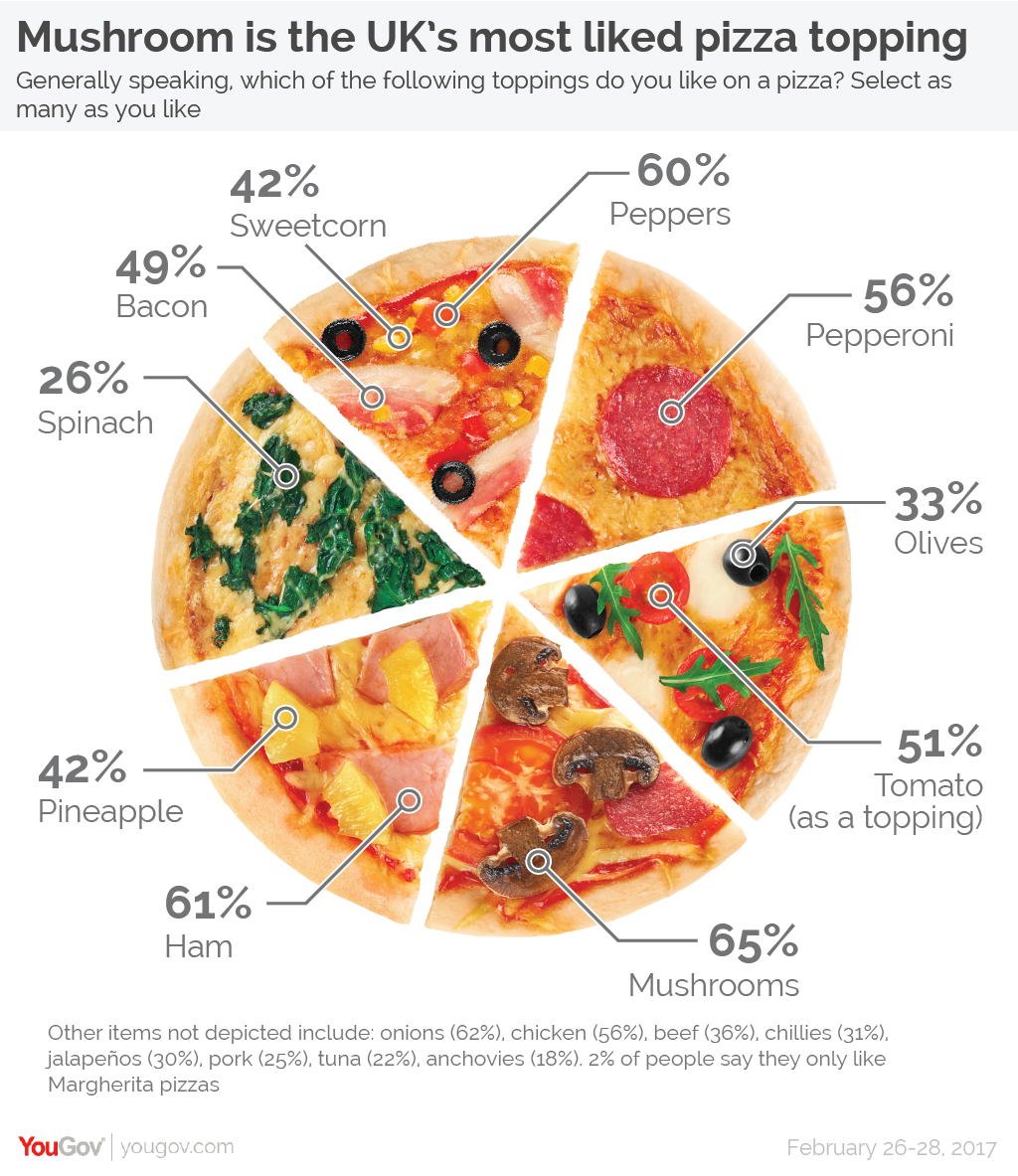
Oftentimes when it comes to data visualization on social media like Twitter, Facebook, or Instagram, information can be distorted. YouGov UK once posted this chart of Britain’s most-liked pizza toppings. Everything looks normal, and quite delicious
at first glance right? But let's see if you can spot what is wrong here:
"It's a pizza chart, not a pie chart. So pie rules don't apply here!"
The most significant problem here is that usually in "pie" chart, each segment represents multiple options, all of which add up to 100%. But on this chart, summing up the percentage, the total number goes to 485%? Should we continue
to add in the percentage which is listed under the pizza chart, the total number of UK residents go up to 767%, which makes no sense and is definitely confusing to the reader.
Another major problem of the chart to be considered is that 9 topping choices are left out in the footnote under the chart. The left out information makes up a large percentage of favored toppings, for example: onions - 62%, chicken - 56%,
beef - 36%, etc.
The graphics attempt to demonstrate the difference in favored topping choices, but all the categories shown in the chart are cut into equal slices while some toppings are significantly less favored than the others.
Possible way to fix the problem
The chart below is just a simple suggestion on fixing the ineffective pizza chart. For further design, I reccommend the page to replace the solid-colored column by the pizza topping graphics. For example, we can put some graphics of corn into
the sweetcorn column instead of the blue color, bacon graphics for bacon column, spinach illustrations for spinach column, etc. However, due to limitation in coding knowledge and lack of design ability, the chart below is so far what I can suggest
to make change to the original chart and make data visualization clearer.